Chances are that you’re not familiar with illustrator Bill Gold, but you’re definitely familiar with his work.
The man responsible for defining the genre of movie poster advertising whose striking work on legendary films like Casablanca, Cool Hand Luke, The Exorcist, and The Sting died Sunday, May 20th at the age of 97. While his style is not as recognizable as that of Saul Bass or celebrated as Drew Struzan, Bill Gold’s nearly 70 year career immortalized as one of Hollywood’s most defining poster creators.
From his first two assignments at Warner Bros. (Yankee Doodle Dandy and Casablanca) to his re-emergence from retirement with J. Edgar in 2011 continuing work with Clint Eastwood’s Malpaso Productions, the work of Bill Gold has been as memorable and iconic as that of the filmmakers for whom he’s designed, including Alfred Hitchcock and Stanley Kubrick.
Here is a partial list of some of our favorites…
Selected stories behind the illustrations
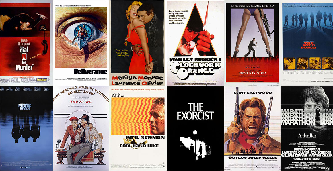
Casablanca (1942)
Gold: “I thought all the characters in this film were very important, so I wanted them in the poster. I put them in the background and put Ingrid Bergman in front of them on the left side of Bogart, but I wanted her to be looking on behind him. I didn’t want to tip off that there was a love affair.” The studio had but one request: Wanting to sell Bogart as a star, it asked if the poster could be more exciting. “So I went back and put a gun in his hand,” he said. It worked.
A Clockwork Orange (1971)
Gold spent six months working on black-and-white poster designs before coming to this poster. The illustration, drawn by Ivan Punchatz, fashions the lead character, Alex DeLarge, as a sacrificial figure to science. “It was more of a symbolic design concept,” Gold said. The poster was never used. “We submitted it to Kubrick, and he didn’t like it. He’s very tough, very exacting. He knows exactly what he wants. He’s brilliant and he’s got phenomenal taste. But this didn’t appeal to him. I guess it was too scientific looking. He wanted more of a flesh-and-blood violence look.”
Deliverance (1972)
When asked to design the international posters, Gold was tasked by executives to create something dynamic to represent a weekend canoe trip from hell. “So I thought, wouldn’t it be great if it had a three-dimensional quality, and it looked like it was coming out of the eye of one of the Southern characters,” Mr. Gold said of the Dalíesque look. The tag line “What did happen on the Cahulawassee River?” added a final mysterious touch.
Mystic River (2003)
For Gold’s final film before retiring, he wanted to keep it simple. Less is more’ is what Clint would always say,” he recalled. “I went to Boston and stayed there for about a month and shot a lot of pictures.” But rather than using stills, he opted for character silhouettes reflected in the water, their lives turned upside down by tragic events. The final image was a composite of a photograph and illustration along with the tag line from the film’s dialogue: “We bury our sins here. We wash them clean.”